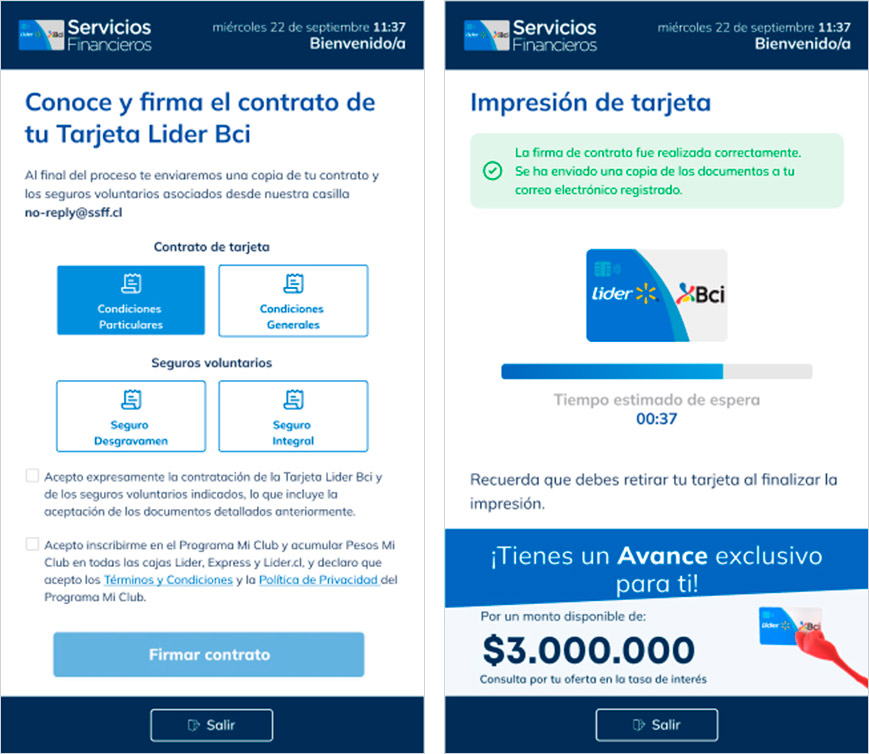


Customer
Lider-Bci Financial ServicesRole in the project
UX Designer, UI Designer & UX WriterResearch and Analysis
Comparative Analysis BenchmarkDesign Methodologies
Design Thinking Information Architecture Usability Testing Iterative ApproachDevelopment and Technologies
Prototyping in Figma Creation of a Design System Use of 27" touch screenYear
2022A channel that didn't exist.
My role: design from scratch a simple, autonomous, and accessible experience for everyone.
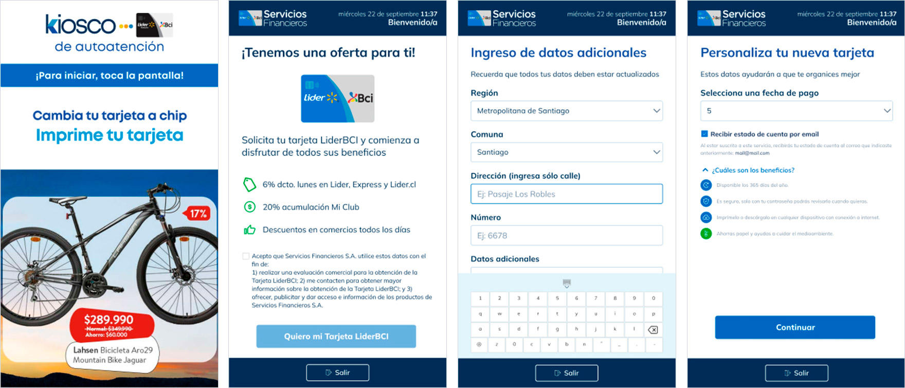
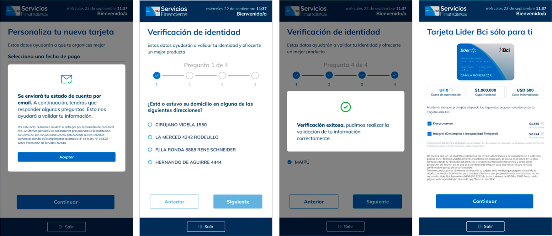
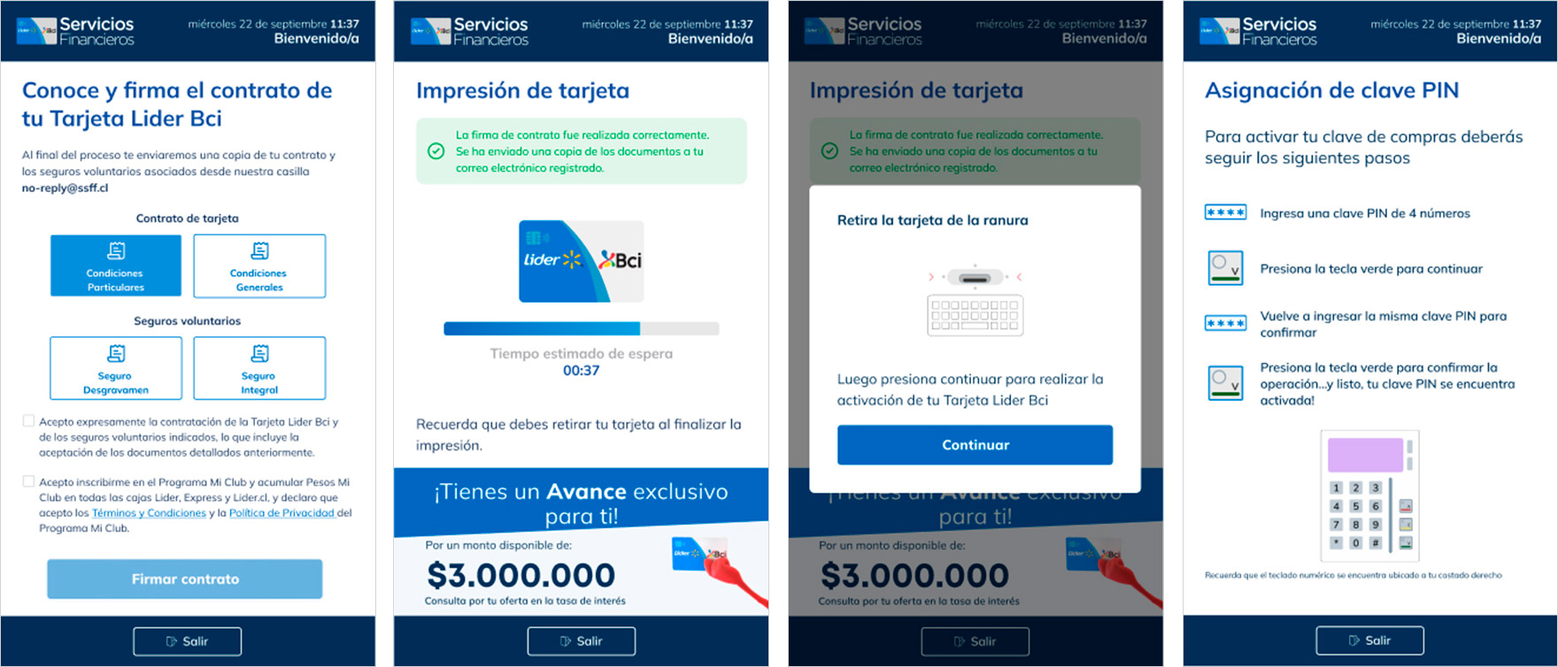
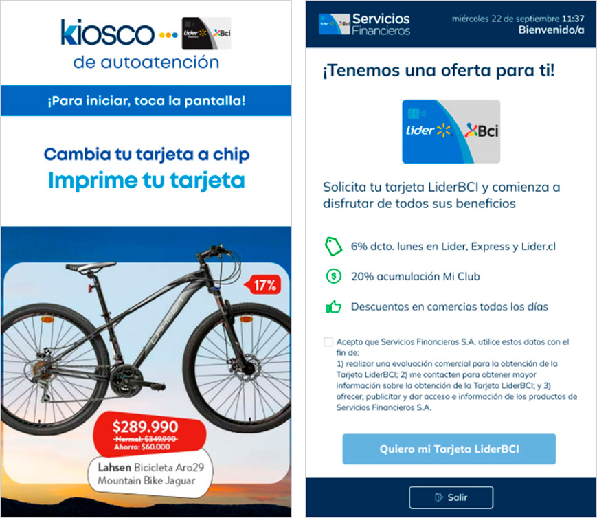
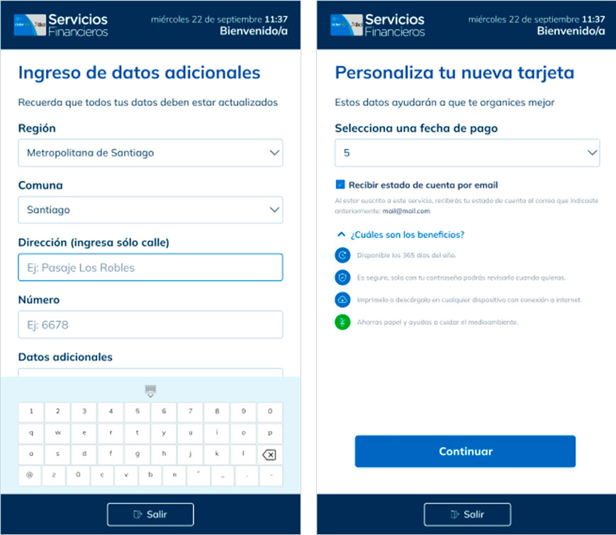
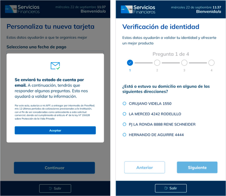
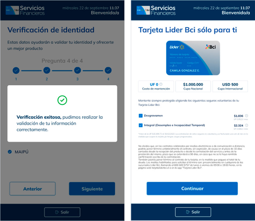
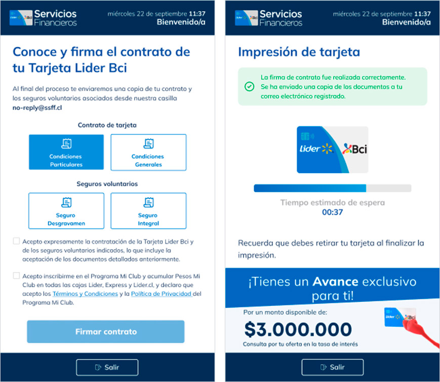
Lider-Bci had no self-service digital channel in any of its branches. Every procedure — from printing a card to signing a contract — required an agent at the counter. The challenge was to build a completely new application for 27" touch screen kiosks, designed for a broad audience (ages 18 to 65) with basic digital literacy, within the noisy, high-traffic environment of a supermarket.
Results
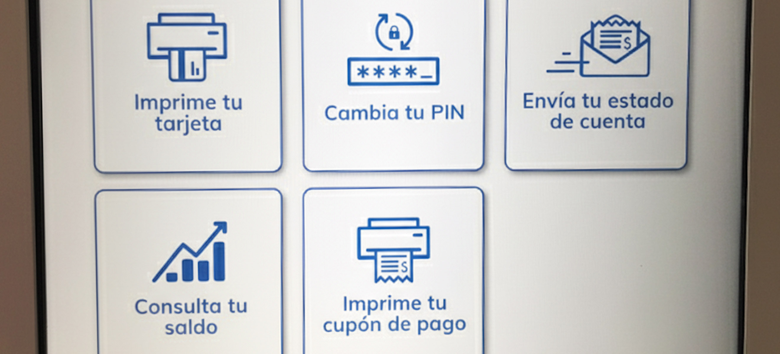
From research to design
Before designing the first screen, I went into the field. I observed the real flow of service at the counter, identified the most frequent procedures, and analyzed how users of different ages interacted with similar interfaces. With those findings, and benchmarks from touchscreen solutions in comparable contexts, we defined the principles that would guide every decision: maximum simplicity, instructions in plain language, and flows with the fewest possible steps. The prototype was built in Figma, integrated into the brand's corporate Design System, and validated with real users before implementation.
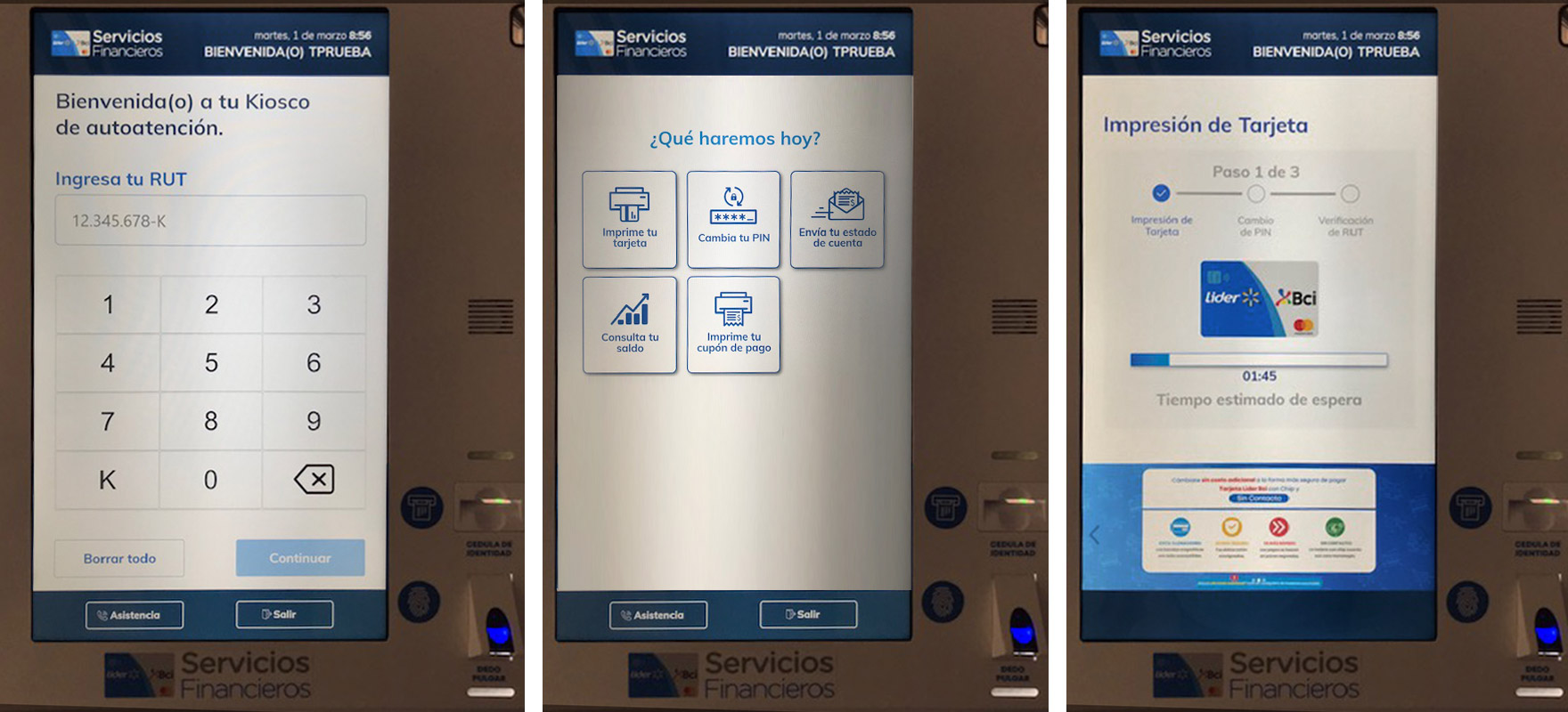
Launch and continuous improvement
The pilot launched with one kiosk per branch and the results were immediate — both in operational efficiency and in user perception. Customers described the kiosk using a word rarely heard in financial services: autonomy. "Being able to print my card this easily is simply incredible" was one of the comments gathered on-site. With that validation, the rollout expanded progressively until the kiosks were present in nearly every branch in Santiago.